
A product I was working on had a few nudges hardcoded into the frontend. My job was to take the whole thing end to end and turn it into a real service. This is what I would tell myself at the start.
Where the word comes from
The word comes from behavioural economics. In Nudge (2008), Richard Thaler and Cass Sunstein describe a nudge as anything that changes how people choose, without taking any option away and without paying them to switch. Their example is a school canteen: put the fruit at eye level and more people take fruit. Nothing was banned and nothing got cheaper.
The second half of that is the part people skip. A nudge has to be easy to say no to. Move the fruit and you have nudged. Remove the crisps and you have banned. Hide the crisps behind a form and you have added friction, which Sunstein later called sludge.
In software, that is the line between a nudge and a dark pattern. A prompt you can close, that stays closed, is a nudge. The same prompt with a hidden close button, or one that comes back on the next page, is a dark pattern in a nudge's clothes. Most of the code in this post exists to make a dismissal stick, so the ethics and the build turn out to be the same job.
What that makes a nudge in a product
A nudge is a small message the product shows you, triggered by the state of your account rather than by you asking for anything. You are down to your last few credits. You finished setting something up two weeks ago and never used it. You just completed your first project.
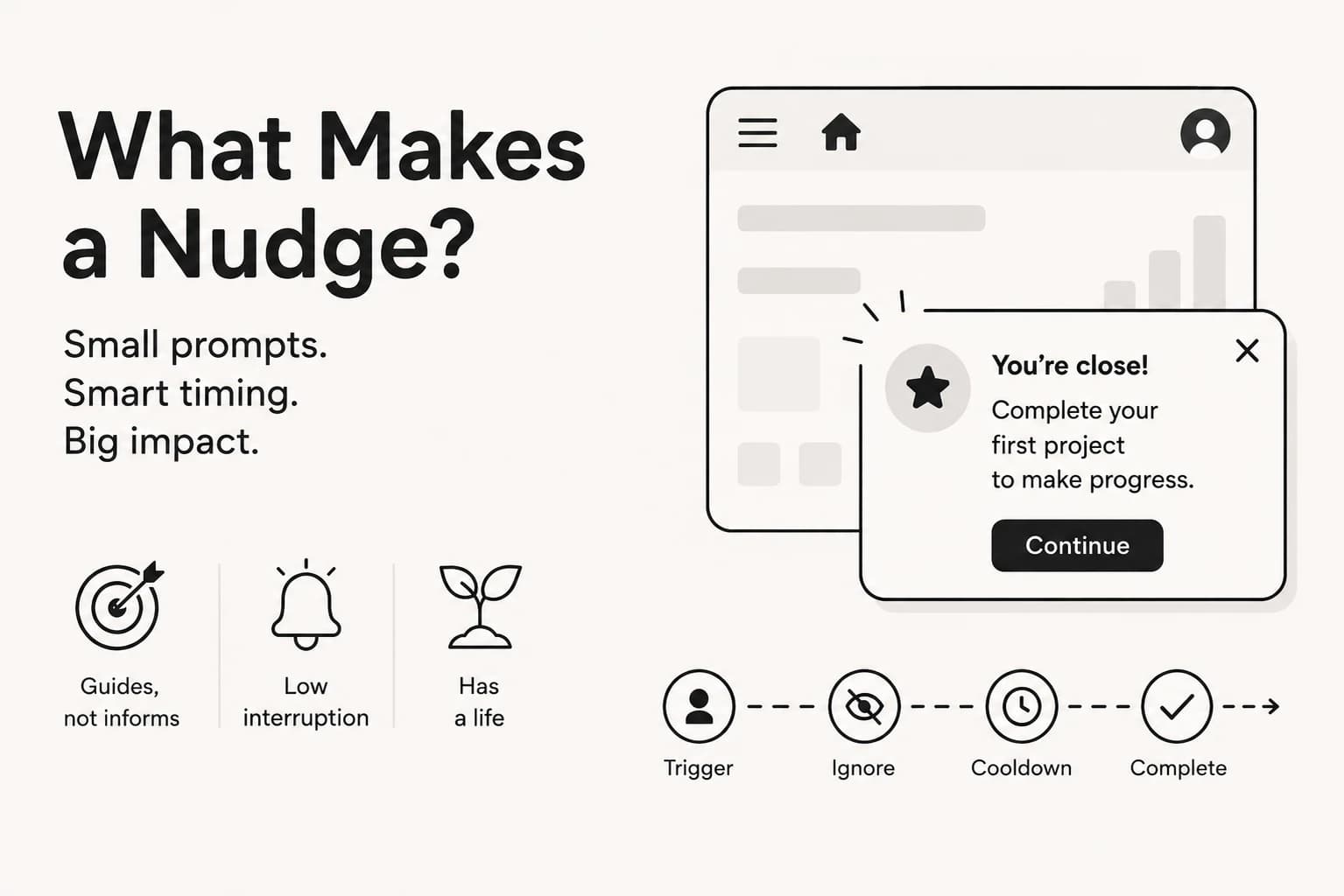
In UX terms it is a small, contextual prompt that guides the user toward an action without interrupting what they are doing. Three properties follow from that:
It guides rather than informs. A nudge exists to change what the user does next. If it only tells them something, it is a message, not a nudge.
It is low interruption. It sits near the relevant action, inside the flow the user is already in, and it is easy and cheap to decline. That last clause is Thaler and Sunstein's, and it is the one that keeps it honest.
It has a life. It shows up when a condition is true. It should give up if the user keeps ignoring it, go quiet for a while if they close it, and stop for good once they do the thing.
That third property is the whole engineering problem. A prompt with a lifecycle is a state machine per user per prompt, and state machines do not live comfortably inside a React component.
Nudge or notification
This is the one people mix up most often, and it decides how you build the thing.
A nudge says: you might want to do this.
A notification says: something happened, come and look.
| Nudge | Notification | |
|---|---|---|
| Purpose | guide behaviour | inform |
| Triggered by | context, user state, behaviour | an event |
| Context | highly contextual | contextual or external |
| Interruptiveness | low | medium to high |
| Location | in the UI, near the relevant action | toast, bell, inbox, email, push |
| Example | "Add a description so the agent knows when to run" | "Your agent finished building" |
| If you miss it | nothing, the condition is still true later | you lost information |
| Stored as | nothing, recomputed each time | a row, written once |
Take a product where a user creates an agent and leaves the description empty. The nudge is a line beside the field suggesting a description and saying why. The notification is "agent created successfully". One is trying to improve what they are making, the other is reporting that a thing occurred.
Or a dashboard where the user has not connected their source control. The nudge is a small card offering to connect it, sitting there at the right moment, demanding nothing. The notification is "source control connection failed", which is an event that has to be communicated whether or not the user wants it right now.
In one line:
- Notification: event, therefore inform.
- Nudge: context and state, therefore encourage.
The last row is the one that changes how you build it. A notification is a row you write once when the event happens, and it never changes after that. A nudge is worked out fresh each time. You never save "this user has a low-credit nudge". You check whether the condition is still true, then check what the user has already done about it. The only thing worth saving is the rules: how many times it has been shown, when it was dismissed, and whether it is finished.
Get that backwards and you end up writing nudge rows into a queue and then fighting to invalidate them, which is a notification system with extra steps and one nobody can explain the behaviour of.
A nudge is a pattern, not a component
The other reason not to model this as a component is that a nudge has no fixed form. It can be a tooltip, an inline suggestion, a contextual banner, a coach mark, a suggestion inside an empty state, a highlighted button, or an onboarding prompt. All of those are nudges when they are driven by context and user state, and none of them share a shape.
Notifications, by contrast, are a communication mechanism with a fairly settled form: a toast, a bell, an inbox row.
So a nudge system has to treat shape as something that varies, not something fixed. That is why the payload further down carries the shape, the slot and the page as three separate fields, and it is the thing I did not plan for on the first attempt.
The scope of work
The job was a set of messages driven by account state. The product had a free tier, a paid tier, a credit balance you spend down, and a few features people could pick up in any order.
They fell into six kinds, and the grouping matters, because each kind needs different rules:
| Kind | Fires when | Should stop when |
|---|---|---|
| Running low | credits are nearly gone | the balance goes back up |
| Activation | something is configured but unused | the user uses it |
| Celebration | a first-time milestone completes | it has been shown once |
| Conversion | usage suggests the paid tier is worth it | the user upgrades |
| Discovery | one feature is used, a related one is not | the related one is tried |
| Re-engagement | the user has been away | the user returns |
Reading down the right-hand column is what convinced me this was a backend problem. Every one of those stop conditions is a fact about the account, not a fact about the session. The browser cannot see most of them, and the ones it can see it forgets on refresh.
Getting one wrong costs different amounts too. A stale "you're low on credits" is mildly annoying and fixes itself. Celebrating the same thing twice looks like a bug. Saying "welcome back" to someone who never left is just embarrassing. So the last two need the strictest state, and I would not ship either on a signal I did not trust.
Where we started
Every nudge lived on the frontend as a condition next to the thing that drew it:
{credits < threshold && !dismissed && <LowCreditsBanner />}With three nudges, this is completely fine. Do not let anyone tell you otherwise. It shipped, it worked, and it cost nobody a week of design meetings.
Then the asks start. Stop showing it after three times. Stop forever once they upgrade. Go quiet for a week if they close it. Oh, and here is a second nudge that wants the same corner as the first one.
Every one of those is reasonable. Every one adds another && somewhere near a component, because that is where the first one went. Six months in, nobody can tell you why a user saw something without opening five files, and every new nudge needs a frontend release.
That is where I came in. The job was to take it end to end: build a backend that decides, and leave the frontend drawing whatever it is told to draw.
The split that made it work
Before the problems, the one idea everything else hangs off.
The backend answers: what should this user see right now, if anything? It reads the account, works out which nudges qualify, applies the rules, decides when to let one through, and puts them in order.
The frontend answers: is there room on screen? That is it. That is the whole job.
The frontend never learns what "low on credits" means. It gets a list and draws it. Which means adding a nudge became a backend change, and the frontend team never had to hear about it.
Simple enough on a whiteboard. Here is what actually went wrong on the way there.
What it looks like, end to end
Here is the whole round trip. One request on page load, two small ones after that.
BROWSER                        BACKEND
   |
   |  GET /nudges/active
   |--------------------------->|
   |                            |  1  read the account
   |                            |     plan, credits, milestones
   |                            |
   |                            |  2  who qualifies?
   |                            |
   |                            |  3  drop the dead ones
   |                            |     finished / capped / in quiet period
   |                            |
   |                            |  4  pacing
   |                            |     quiet window? daily cap?
   |                            |
   |                            |  5  sort by priority
   |                            |
   |  [ { id, pattern,          |
   |      placement, routes,    |
   |      content } ]           |
   |<---------------------------|
   |
   |  keep the ones whose routes match this page
   |  put each into the slot named by placement
   |  draw the shape named by pattern
   |  one per slot, highest priority wins
   |
   |  POST /nudges/:id/view
   |--------------------------->|  count + 1, stop at the limit
   |
   |  POST /nudges/:id/dismiss
   |--------------------------->|  quiet until now + N days
Steps 3 and 4 are the two that took me longest to get right, and they are different jobs. Step 3 asks is this nudge still alive at all. Step 4 asks is now a good moment.
The pieces, in code
Three types carry the whole system. If you only copy one thing from this post, copy these shapes.
What an author writes. One entry per nudge, and this is the only file that changes when you add one:
type NudgeDefinition = {
  id: string
  priority: number

  // step 2: does this user qualify right now?
  qualifies: (ctx: EvalContext) => boolean

  // step 3: is it over for good? (they did the thing)
  finished?: (ctx: EvalContext) => boolean

  // the rules
  maxShows?: number     // stop after N views
  quietDays?: number    // silence for N days after a dismiss

  // what to draw
  render: NudgePayload
}
What the account looks like when you evaluate it. Build this once per request, then every qualifies reads from it. Keeping it a plain object is what makes the rules testable without a database:
type EvalContext = {
  plan: "free" | "paid"
  creditsRemaining: number
  creditsPercent: number
  generationCount: number
  hasCompletedSetup: boolean
  daysSinceLastActive: number
}
What goes over the wire. A union on pattern, so adding a shape forces you to say what content it carries:
type Base = {
  id: string
  placement: "top_banner" | "bottom_toast" | "floating" | "center"
  priority: number
  routes?: string[]
  icon?: string           // a name like "zap", never an SVG
  tone?: "default" | "warning"
}

type NudgePayload =
  | (Base & { pattern: "banner" | "toast" | "badge"
              content: { text: string; cta?: string; ctaHref?: string } })
  | (Base & { pattern: "card" | "slide_out"
              content: { title?: string; text: string; image?: string
                         cta?: string; ctaHref?: string } })
What the database remembers. One row per user per nudge. This is the only nudge state that is ever written down:
create table nudge_state (
  user_id       uuid        not null,
  nudge_id      text        not null,
  show_count    int         not null default 0,
  last_shown_at timestamptz,
  quiet_until   timestamptz,
  finished      boolean     not null default false,
  finish_reason text,                              -- 'did_the_thing' | 'hit_limit'
  primary key (user_id, nudge_id)
);
Notice what is missing. There is no row saying "show this user a low-credit nudge". Nothing queues a nudge. The nudge is worked out fresh on every request, and the only thing on disk is what the user has already done about it.
And on the frontend
Four pieces, none of which know what any nudge means.
<NudgeProvider>                one per app, inside the logged-in layout
   |  polls /nudges/active
   |  holds the list
   |
   +--> route filter           does this page match its routes?
   |
   +--> <NudgeSlot name="top_banner">
   |         picks the highest priority nudge for this slot
   |         |
   |         +--> <NudgeRenderer>
   |                 switch (pattern) -> Banner | Toast | Card | SlideOut
   |                 resolves icon name -> component
   |                 reports view / click / dismiss
   |
   +--> <NudgeSlot name="bottom_toast">
   +--> <NudgeSlot name="floating">
Add a slot by mounting one more <NudgeSlot>. Add a nudge by writing a NudgeDefinition on the backend. Those are the only two moves, and only one of them touches the frontend.
What broke, and what I did about it
1. I named the shape after the page
My first shape was named after the page it appeared on. Then we wanted that same shape somewhere else, and the name was a lie.
The fix: one field became three.
| Field | Question it answers | Examples |
|---|---|---|
pattern | what shape is it | banner, toast, card, slide_out, badge |
placement | which slot does it sit in | top_banner, bottom_toast, floating, center |
routes | which pages may show it | blank for anywhere, or a list |
Rule of thumb: if a shape name contains a place, or a slot name contains a page, it will be wrong within a month.
Two small choices that saved me later. Send the icon's name, not the icon, so the payload says "zap" and a new icon needs no frontend change. Make the payload a union on shape, so TypeScript complains when someone adds a shape and forgets to say what goes inside it.
2. The rules had nowhere to live
On the hardcoded version, "dismissed" was component state. It forgot the moment the user clicked a link.
The fix: a table. One row per user, per nudge: how many times shown, when it was last shown, when the quiet period ends, and whether it is finished for good.
That table is what makes the rules mean anything. Quiet for a week after a dismiss. Stop after three views. Done forever once they upgrade.
One rule I would set on day one: one slot, one nudge. Never stack them. Two banners in the same corner is how a helpful app turns into an annoying one.
3. The user had six tabs open
Every tab drew the banner. Every tab reported a view. The three-view limit burned through in one page load.
The fix: count in the database in one atomic step, and add a short lock so the first tab to report a view takes it and the rest bounce off for a few seconds. Six tabs, one view.
4. Closing one nudge summoned the next
This was the real gap, and it took me a while to see it properly.
All the pacing lived on the frontend. The backend knew what a user qualified for, but nothing about when to let it through. So the moment someone dismissed a nudge, the next eligible one was already sitting in the list, and up it came. Close that, here comes a third.
From the user's side that is not a helpful product. That is being nagged.
The frontend was trying to hold the line on its own, with quiet gaps and a per-visit limit, and it could not. Every tab paced itself separately, none of them survived a refresh, and the backend cheerfully kept handing over more.
The fix: pacing belongs in the orchestrator, not the browser. The backend now owns a quiet window after any dismiss and a daily cap per user. It simply does not hand you a second nudge straight after you closed the first, no matter how many tabs you have open or how many times you refresh.
The frontend kept exactly one thing, because it is genuinely a display concern: a minimum display time, so a nudge that appears and instantly stops qualifying does not flicker.
Everything else went in the bin, including some BroadcastChannel code I was quite proud of. Tabs already agree, because they all ask the same server and the server counts properly.
The lesson: if the client keeps its own copy of something the server already knows, you have two truths and a bug waiting.
5. I polled far too fast
My instinct was to ask the server every few seconds so things felt instant.
But none of this moves fast. Plans, credit balances, milestones: all slow. Meanwhile every poll pays for an auth check and a user lookup, for every signed-in user, forever. Fast polling buys the same answer at triple the price.
The fix: poll every few minutes, then close the gaps from the other side.
- Pause while the tab is hidden, and refetch when the user comes back.
- When something real changes, like the user spending credits, clear that user's cache on the spot.
- If something truly has to be instant, make it an event, not a faster timer.
The cache expiry is what keeps the answer correct. Clearing it early only makes it quicker.
What I would do next
Things I never got to, roughly in order.
Use real events instead of polling another service. Polling an analytics store on a timer gives you answers that are minutes old and often measured per team when you wanted per person. Fine for "has this user ever done X". Bad for anything meant to feel immediate.
Put the shared types in one package. Both sides keep their own copy of the same list of allowed values. That works right up until someone adds a shape to one side and not the other.
Check what your signals actually measure. Some of mine counted per team when the message was per person, so one teammate's activity could switch off someone else's nudge. If the signal is rough, use a quiet period rather than ending the message for good. Ending it wrongly is something the user can never undo.
Measure whether any of it worked. Views and clicks tell you almost nothing alone. Link a view to whether the user actually did the thing afterwards, and you find out which nudges earn their slot and which ones to delete.
Build every slot you name. I defined slots that never got added to any page. A nudge pointing at one qualifies forever, never appears, never counts a view, and quietly holds a place in the queue it can never use.
If you are building one of these, four things would have saved me the most time. Put the decision on the server first. Give it a table before you add a second nudge. Keep shape, slot and page as three separate fields from day one. And pace it on the server, not in the browser.